UX Design That Conveys a Sense of Urgency
- hyeju park
- May 22
- 5 min read

Updated: 3 days ago
Doctoral thesis works Duration: 08.2025 Design&Research Tools: Multiple Regression Analysis/Usability Test / Figma
Project background
What kind of UX design can make users perceive a strong sense of urgency using only visual and interaction components?
Current emergency alert systems often rely on standardized platform components, making disaster alerts visually similar to ordinary notifications or text messages. As a result, users may fail to immediately distinguish critical alerts from everyday information.
This research investigates how visual design elements — including layout shape, screen coverage, color ratio, typography, and information hierarchy — influence users’ perceived level of urgency. Through regression analysis and user evaluations, the study explores how UX components alone can communicate emergency severity more effectively.
Research
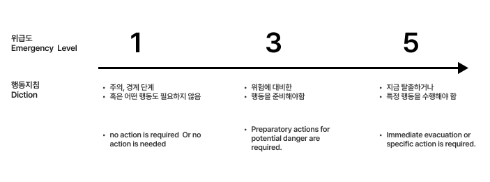
In this study, “urgency” was defined as:
“Whether the user must take immediate action to avoid danger.”
Research from Australian emergency alert agencies and international disaster communication studies suggests that urgency is not determined solely by the scale of a disaster, but by whether immediate personal action is required.
For example, even if a severe hurricane is expected to hit Florida in five hours, it represents low urgency for someone currently living in Korea. In contrast, a wildfire occurring near the user’s home demands immediate attention.
This study visualized urgency from the perspective of proximity, immediacy, and required action.
Research Method
The research was conducted through two separate user studies.
Phase 1
The first study isolated individual visual variables to identify
which design elements most strongly influence perceived urgency.
Phase 2
The second study combined these visual variables into five levels of urgency-based interaction designs
and evaluated user responses to integrated UX scenarios.
First User Evaluation
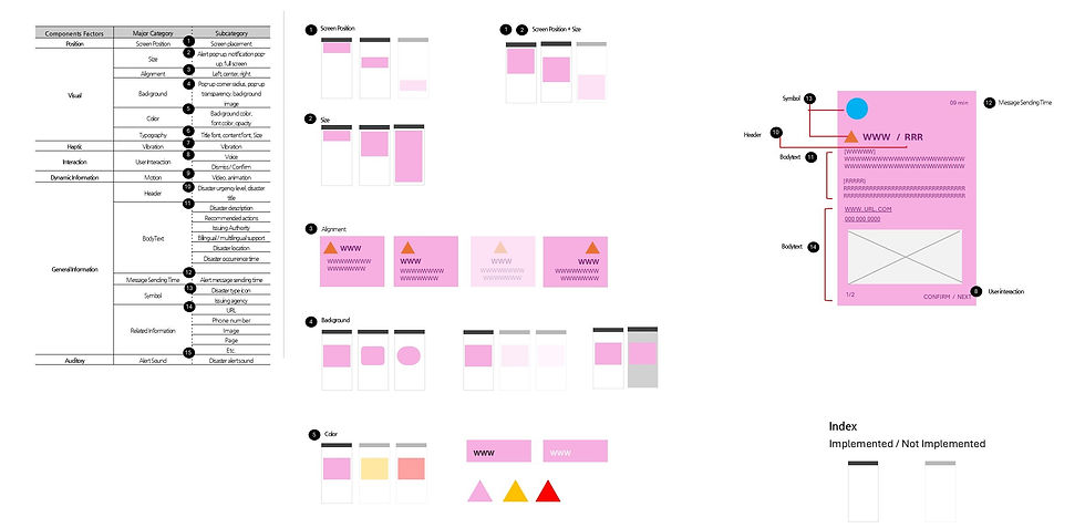
The following visual factors were set as independent variables:
Notification position
Screen coverage area
Pictogram size
Color coverage ratio
Typography size
Alignment order
Users were asked to evaluate the perceived urgency of each screen design.
A total of 50 design variations were tested with 35 participants. Based on the results, a regression equation was derived to explain which visual factors most significantly affected urgency perception.


Results of the First User Evaluation
Reliability of the Research Model
A linear regression analysis was conducted to identify the factors affecting
perceived urgency in emergency alerts.
All independent variables were converted into categorical variables,
and the analysis was performed using jamovi.
The model produced the following results:
Correlation coefficient (R): 0.638
Coefficient of determination (R²): 0.407
This indicates that approximately 40.7% of perceived urgency could be explained by the selected visual variables.
The model was statistically significant:
F(11, 1176) = 73.4
p < .001
These results confirm that the independent variables had meaningful effects
on users’ urgency perception.
.
-User Evaluation Results-
All three layout types — card, square, and fullscreen —
showed statistically significant effects at the p < .001 level.
Among them, the fullscreen layout demonstrated the strongest influence on urgency perception,
with a standardized regression coefficient of 0.4689.
The square and card layouts followed with relatively high influence levels.

Qualitative User Feedback
In addition to quantitative analysis, qualitative interviews were conducted.
Users expressed that they wanted emergency alerts to appear strongly and clearly,
while still being able to continue using their mobile devices.
“A smartphone itself is also a disaster-response tool.”
Second User Evaluation
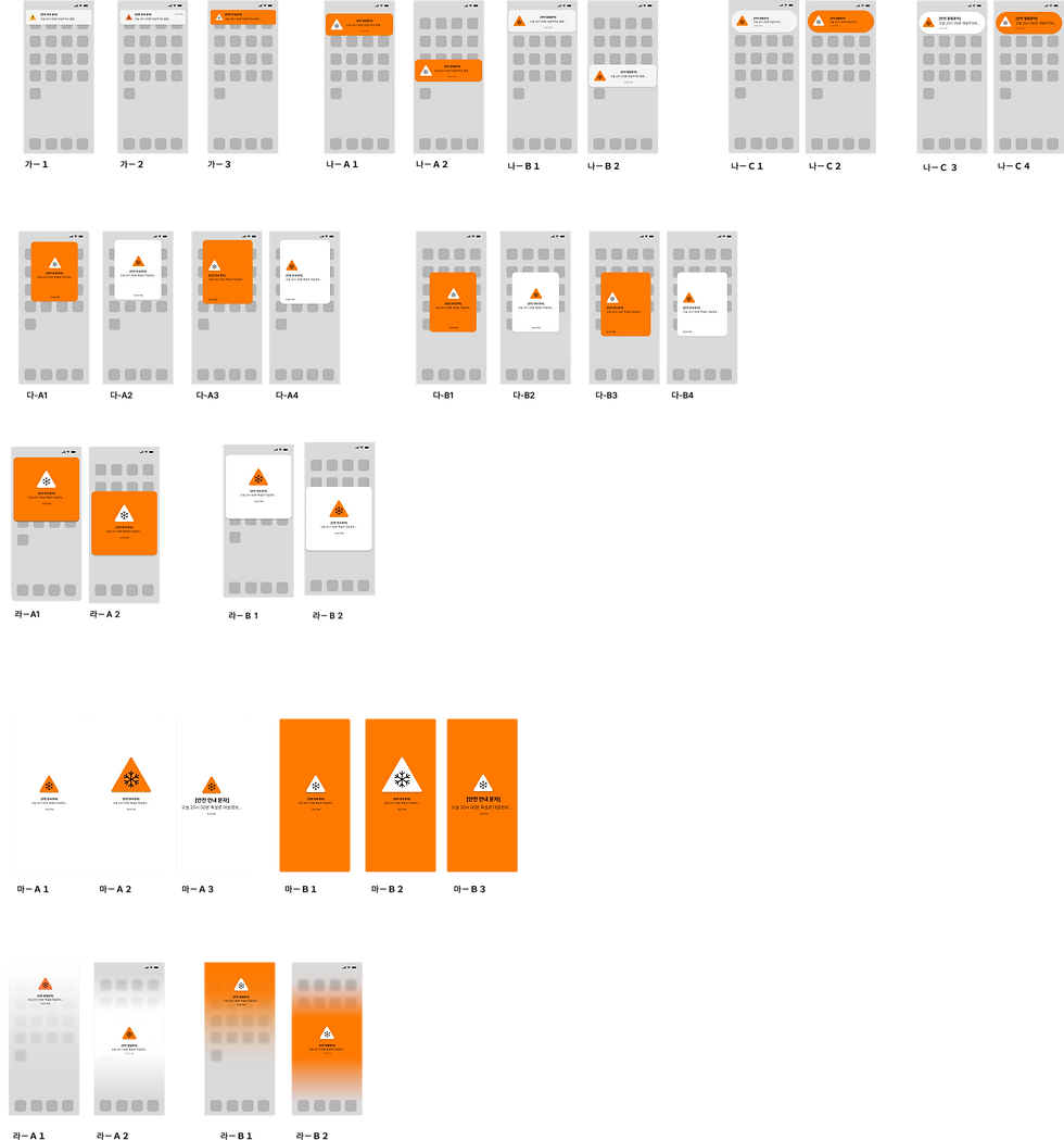
Using the regression results from the first study, urgency scores were calculated and translated into five urgency-based interaction designs.
The interaction concepts were divided into:
A/D types: urgency differentiated by screen coverage and spatial hierarchy
B/C/D types: urgency differentiated primarily through color intensity and notification behavior
Some designs maintained a consistent layout while only changing color,
while others altered folding behavior and interaction flow depending on urgency level.
All concepts incorporated “notification folding behavior”
based on qualitative user feedback.
Five interactive prototypes were created and evaluated through a second user study.
The evaluation questions were based on ISO usability standards, with an additional aesthetic evaluation category.

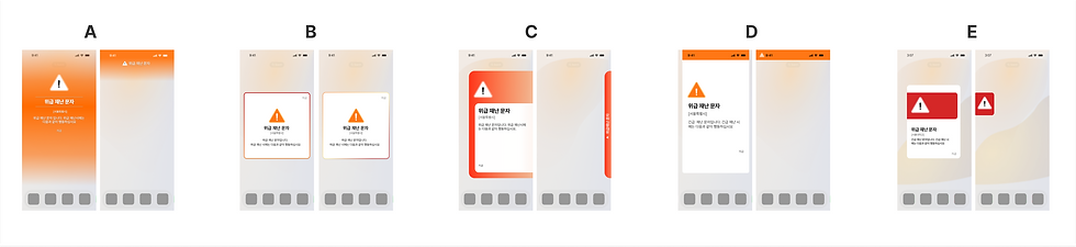
Interactive Prototypes Used in User Evaluation
Five interactive design prototypes were evaluated through usability testing.


Usability Test Results and the Gradient Effect
The interaction model distinguished between “urgency” and “emergency severity” at the interface level.
A total of 250 participants evaluated the five interaction prototypes.
ISO usability criteria were translated and localized for Korean participants. Reliability testing using Cronbach’s Alpha confirmed that the translated evaluation items maintained strong reliability.
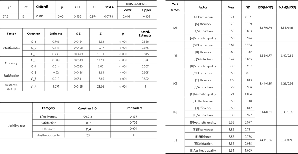
As a result, Design A achieved the highest combined score in both ISO usability evaluation and aesthetic satisfaction.
An improved gradient-based version derived from Design A was selected as the final design direction.
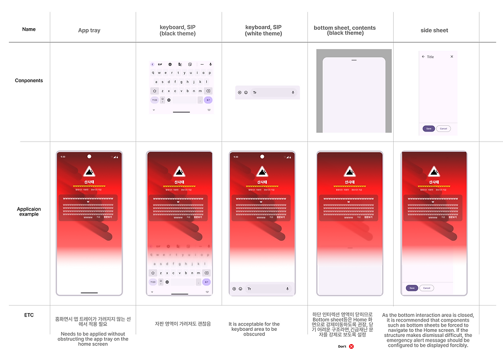
Practical Implementation Testing
To implement realistic height values and overlay behavior, both Android and iOS system components were analyzed.
The gradient overlay levels were carefully adjusted to avoid blocking critical mobile interactions such as:
Home navigation
Bottom app bars
SIP keyboard interactions
Chat interfaces
These interaction constraints became key factors in determining detailed urgency-level height values.

Differentiated Color Areas Based on Urgency
Based on experimental results, the gradient-based design received the most positive responses
and was selected as the final direction.
The final implementation carefully considered coexistence with native Android and iOS UI systems.

Notification Folding Based on Urgency
During user interviews, participants described smartphones as:
“A tool for disaster response.”
Users wanted to clearly recognize urgent situations while still being able to use their phones for communication, research, and coordination.
To balance these needs, the system introduced:
AI-based alert summarization
Different notification persistence behaviors depending on urgency
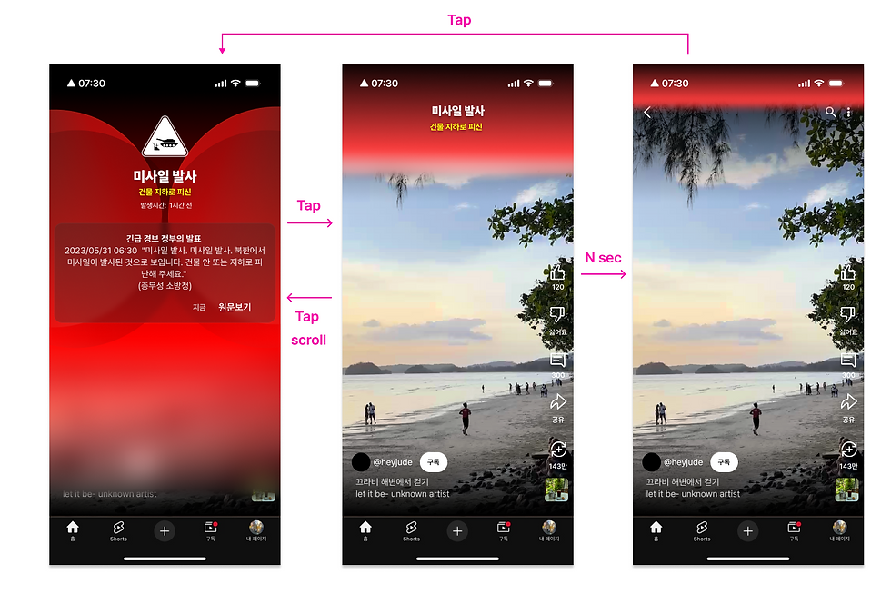
AI-Based Alert Summarization
After users check an alert, the system identifies the most critical required action using AI and minimizes the notification into a concise summary format.
Changes in Notification Behavior by Urgency Level
Notification persistence behavior changes according to urgency severity.
Highest Urgency
Persistent summarized notification
Notification panel color transformation
High Urgency
Summarized notification provided
Medium Urgency
Notification panel color change only
Low / Informational Alerts
No persistent urgency treatment
Highest Urgency

High Urgency

Medium Urgency
Final Gradient Interaction Design
In the final design, AI analyzes emergency message content to provide:
Automatic translation
Quick-action guidance
Priority-based notification behavior according to urgency level
The final prototypes reconstructed real emergency alerts issued in different countries.

Reconstructed from the 2024 U.S. hurricane alert system
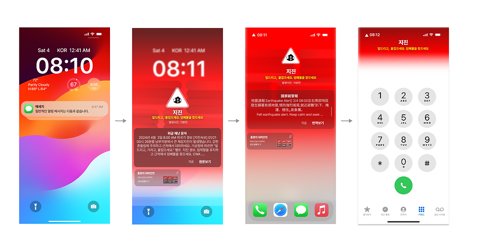
Reconstructed from the 2024 Taiwan earthquake alert
Reconstructed from the 2024 Philippines Mount Pinatubo alert
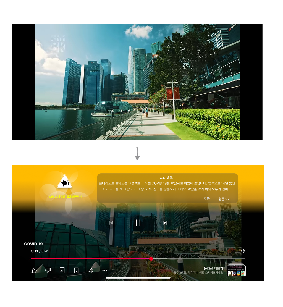
Reconstructed from Korea’s 2023 COVID-19 emergency alerts

Reconstructed from Korea’s 2024 subway construction emergency notification
Reflection
This project began with a fundamental question:
“What defines urgency?”
The research involved categorizing urgency levels and designing differentiated UX behaviors for each severity stage.
It also required extensive international research into standards related to color systems, icons, visual hierarchy, and emergency communication frameworks.
Additional studies on color systems, icon design, and visual cue selection are documented separately in other sections of the portfolio site.


Comments