Change in Icon Communication and Direction of Next-generation Icon
- hyeju park
- 2 days ago
- 6 min read

ABSTRACT
Symbols include letters, signs, and logos used in visual communication methods. With the commercialization of smartphones in2007, symbols began to expand into new areas called application icons.
While working as a mobile UX designer from 2011 to 2019, the researcher experienced firsthand changes in icons and UX. In this process, research became interested in two topics. Regarding the first—the trend toward change in the age of communication—, questions are related to the history of mobile icons in communication. Just as symbol sand visual images generated from texts have changed, mobile icons are also undergoing communication changes. Second, depending on the users generation, at what point do communication differences occur? Communication errors often occur among users because their understanding of preferences is significantly different due to differences in personal, cultural, social, and generational environments. To answer these questions, the researcher wanted to find a point at which icon communication changed between the advent of mobile technology and the present specifically, 2020. In particular, preload icons mounted on smartphones from 2007 to 2020 were selected as subjects for analysis and examined annually to identify how objects, interpretants, and representamina have changed from a semiotic perspective. The results of the study are as follows. First, mobile icons have deviated from the imitation of reality and developed into cultural symbolsthat grow organically on their own. Early icons borrowed metaphors and interpretants to describe their functions and services by substituting them for real-world images of objects. However, starting in 2013, we began to use functions within smartphones for a new interpretation. As of 2020, icons are building their own organic ecosystem based on mobile experiences, not physical objects. Second, technological advances affect the construction of new icons. We can find examples of moving icons that move according to mobile conditions and technologies used in apps. Third, the mechanism of icons switched between 2013 and 2014. Changes began in the way icons were borrowed from analog objects; now, they grow organically and reproduce images of different symbols.Fourth, icons are influenced by cultural environments, such as social movements. Alternatively, even though the culture has changed, the symbol may be fixedResearch results have been presented via panels and websites, visualizing icon object changes, graphic trends, and the impact of society and technology on icons. Finally, the conclusion briefly suggests the creation of next-generation icons based on the results of the study and highlights the need for follow-up studies.
Read the Original
Conducted before the commercialization of generative AI, this study explored how mobile icons evolved into an independent visual language within mobile ecosystems.
Icon Archiving Results
CALL
Telephone icons consistently maintain a similar appearance.
Even as design styles evolve, the classic handset form continues to be preserved.

Message / Email
Message icons gradually shifted from email-related forms to the speech bubble metaphor,
while email icons continue to preserve the traditional envelope representation.

Camera apps
have evolved in the details of their lens and body design over time, but they have consistently retained the camera as their core visual metaphor. This continuity enables users to recognize the function intuitively across different platforms and devices.

Voice Recorder
icons initially relied on microphones and recording devices as their primary visual metaphors. Over time, Samsung and Huawei shifted from microphone-based representations to record-button imagery, while iOS introduced graphic equalizers as a new visual symbol around 2013. This transition may have occurred to differentiate the icon from other microphone-based services, or because users became more familiar with on-screen recording interfaces than with physical recording devices as smartphone usage increased.
The evolution of Siri and Voice Recorder icons illustrates how mobile icons develop around visual metaphors that users can easily recognize. Early designs borrowed heavily from physical objects found in everyday life, whereas later icons increasingly reflected digital functions and interface elements within the mobile ecosystem. The case also demonstrates that a single function can be represented by multiple visual symbols, while the same symbol may refer to different functions, highlighting the organic and evolving nature of mobile icon communication.

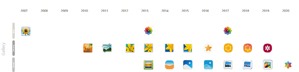
Gallery
icons have evolved beyond the traditional printed-photo metaphor. While the photo frame itself gradually disappeared, the flower image commonly depicted within photographs remained as a recognizable symbol representing the gallery. In addition, color wheels emerged as a new visual metaphor, reflecting the gallery's role in displaying diverse colors and visual content. This evolution demonstrates how elements of earlier analog representations were not discarded entirely, but rather reinterpreted and reproduced into new icon forms.
Calculator
icons have primarily evolved around arithmetic symbols and the visual form of analog calculators. Early iOS calculator icons emphasized physical buttons through shading and dimensional effects, reinforcing the interaction model of pressing real keys. Samsung and Huawei initially adopted calculator devices as their visual metaphor but later simplified their icons by focusing on arithmetic symbols such as addition, subtraction, multiplication, and division.
Interestingly, from around 2017, iOS calculator icons returned to a design that resembled the overall calculator interface. However, considering Apple's broader shift toward using digital interface elements as visual metaphors—seen in icons such as Siri and Voice Recorder—it is more likely that the icon referenced the calculator's UX interface rather than the analog device itself. This reflects a broader transition from physical-object metaphors to interface-based visual representations.

Calendar
icons provide a clear example of a visual symbol that has consistently retained dates and weekdays as its core representation since the early smartphone era. Users can instantly recognize the function through the displayed date and day, regardless of platform.
In the early years, Apple, Samsung, and Google commonly used spiral-bound paper calendars as the primary visual metaphor. However, Apple began moving away from this analog representation around 2013, followed by Samsung and Huawei in 2014. Samsung later reintroduced elements of the calendar form in 2017, but in a simplified and more digitalized manner rather than reproducing the detailed appearance of a physical paper calendar. This evolution illustrates the broader shift from representing physical objects to emphasizing functional recognition within mobile interfaces.

Settings
icons represent one of the most stable visual metaphors across mobile platforms. Apple, Samsung, and Huawei have consistently relied on gear imagery as the primary symbol, with some versions drawing inspiration from mechanical watch movements. While iOS and Huawei often used multiple interconnected gears, Samsung generally maintained a single-gear representation. The icons also retained similar color schemes over time, reinforcing a shared visual understanding of system settings across different manufacturers.

Internet (Safari/Browser)
icons initially relied on real-world navigation metaphors such as globes, maps, and compasses. Over time, however, these analog references became increasingly simplified or disappeared altogether. By 2020, browser icons had shifted toward abstract circular forms rather than directly representing the Earth or geographic maps.
While iOS continued to use the compass as its core visual metaphor, it progressively removed directional markers, shading, and detailed elements, leaving only the essential compass needle. At the same time, references to globes and maps became less prominent, reflecting a transition toward a more abstract and digitally native visual language. Despite these changes, major platforms consistently retained blue circular forms within their browser icons, creating a shared visual identity for internet-related services.


Conclusion
This study analyzed the evolution of mobile icons from 2007 to 2020 and found that they have moved beyond imitating real-world objects to form an independent visual language unique to the mobile environment.
The findings suggest that mobile icons have evolved from simple functional indicators into cultural symbols shared by large user communities. Technological advancements have also played a critical role in shaping new icon forms, with mobile features and interface elements themselves becoming visual metaphors. Rather than remaining fixed, icons continuously evolve through cycles of growth, adaptation, and decline.
New icons rarely emerge without precedent; instead, they reinterpret and reproduce existing symbols. Examples such as the flower motif in Gallery icons and the transition from microphones to equalizers in Voice Recorder icons demonstrate how a single function may be represented by multiple symbols, while a single symbol may also refer to multiple functions.
Ultimately, mobile icons are no longer representations of physical objects alone but have become an independent visual language grounded in mobile experiences. As a result, future icon design should focus on visualizing the most recognizable and meaningful aspects of a feature or user experience, rather than simply replicating real-world forms.


Comments