Enhancing Mobile Emergency Alerts with Visual Cues
- hyeju park
- Mar 15
- 7 min read

Publish: 2025.08 Tool: Figma Member: Indivisual work Woking Type: GUI, MOTION
Problem/ Background of poroject
Why Are Additional Visual Cues Needed in Emergency Alerts?
Disasters are broadly categorized into natural disasters and social disasters. Since the COVID-19 pandemic in 2021, social crises such as infectious diseases have increasingly been recognised as disasters requiring systematic public communication. As governments began delivering risk notifications through mobile devices, personal smartphones have effectively become part of a public infrastructure for disaster communication.
However, current emergency alert systems largely rely on text-based messages. To understand these alerts, users must be able to read the language in which the alert is written and possess a basic level of scientific and social knowledge related to the disaster. This requirement creates barriers in multicultural and multilingual environments.
Interviews with international users revealed that in many countries, individuals frequently belong to multiple cultural or linguistic contexts, where the mother tongue and the official language differ. To address this, many governments provide emergency alerts in two or more languages. Nevertheless, even when the official language and the mother tongue are the same, the length and complexity of written messages can vary significantly across languages. Some interview participants reported that they preferred viewing alerts in English rather than their native language because the translated messages were shorter and easier to scan.
As a result, many users end up processing emergency alerts in a third language that is neither their mother tongue nor their primary communication language. Under such conditions, the speed at which users can recognise and interpret emergency information through mobile alerts becomes significantly slower.
This limitation highlights the need for additional visual cues—such as icons, colour coding, or visual hierarchies—that allow users to quickly recognise the type and urgency of a disaster without relying solely on textual comprehension.
This project aims to
minimise language dependency in mobile emergency alerts.
To help users understand both social and natural disasters,
visual cues were introduced to represent the direction and force of each disaster.
By visualising how a disaster occurs,
the system helps users quickly recognise and interpret the situation without relying solely on text.
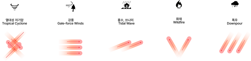
Types of Disasters
Disasters can broadly be categorised into natural disasters and social disasters. The disaster types selected in this study were based on categories that are commonly used across national disaster classification systems.
A total of 14 representative disaster types were examined, including nine natural disasters and five social disasters, and visual cues were developed for each type.
An analysis of these disasters revealed a common underlying characteristic: the flow of energy.
Natural Disaster | Social Disaster | |
Definition | Natural disasters are events caused by natural phenomena that threaten human life, property, and the environment. Natural disasters are serious disruptions triggered by natural hazards that cause widespread human, material, economic, or environmental losses.(UNDRR) | Social disasters are events caused by human activities, technological systems, or failures in social and management systems. Human-induced disasters result from human actions, technological failures, or social systems that cause widespread damage and disruption.(IFRC) |
Type | 9 Tropical Cyclone / Flood / Landslide / Earthquake / Volcanic eruption / Wildfire / Cold wave / Severe wind / Heavy rainfall | 5 Epidemic / Terrorism/ Hazardous Material Incident/ War/ Child abduction / Infrastufture |
Design Guideline
Basic Principles
The visual system is structured based on the user’s spatial perspective:
Ground — the area closest to the user
Sky — the area above and farther from the user
Surroundings — the spaces on both sides representing the environment and other people
This framework helps visualise how disaster forces move in relation to the user.

Visual Cue
Natural Disasters
Energy Flow Direction
Natural disasters occur through the movement of natural forces such as water, wind, or seismic energy.
Recognising where these forces move and how they spread is key to understanding and responding to the disaster.


Social Disasters
Energy Diffusion and Spread
Social disasters involve not only the flow of energy, but also the potential to spread or propagate through social systems and networks.In addition to following general safety recommendations, it is important to remain aware of related risks and surrounding conditions.


Natural Disasters
For natural disasters, the visual cue system was designed based on the spatial orientation of the mobile device.
The area closer to the user is defined as ground, while the area near the indicator (top of the mobile screen) is defined as sky, representing a position farther from the user.
Based on this spatial model, the direction of energy flow is visualised through the placement of visual cues.If the energy originates from the sky, the visual cue appears from the top of the mobile screen.If the energy originates from the ground, the visual cue appears from the bottom of the screen, closer to the user.
This approach helps users intuitively understand the direction and origin of natural disaster forces.
Energy Flow Direction of Natural Disasters
The direction from which each disaster force flows is visually represented.

Social Disasters
Social disasters are often driven not only by the movement of energy but by the influence and impact that spread through social systems.Unlike natural disasters, they involve complex relationships and contextual factors, including surrounding environments and human interactions.
To represent this characteristic, a circular metaphor was used to visualise how the impact of social disasters spreads outward to the surrounding context.
Representing the Direction
and Spread of Social Disaster Impact

Animation Speed and Direction of the Cue
Natural Disasters
The animation focuses on representing energy flow, using simple and familiar movement patterns to communicate direction clearly.

Design Focus
The animation focuses on visualising the flow of energy.
Motion Principle
Simple and familiar motion patterns are used to clearly communicate movement and direction.
Social Disasters
The animation is inspired by the rhythm of the human heartbeat, creating a pulse-like motion that enhances the sense of urgency and attention.

Design Focus
Represent the spreading influence of social disasters through a heartbeat-inspired visual metaphor.
Motion Principle
Pulse-like motion, inspired by the rhythm of the human heartbeat, is used to visualise how the impact of social disasters spreads outward.
Design Application by Risk Level
The design was developed based on a five-level risk classification system, which represents one of the most detailed international standards for emergency alert severity.
Level 5 (Extreme Risk) uses black and red tones to indicate the highest level of urgency.
Levels 4–2 (High to Moderate Risk) use orange and yellow tones to represent increasing levels of warning.
Level 1 (Low Risk) is presented with a white base, indicating the lowest level of urgency.
The colour system was developed with reference to the Australian emergency alert guidelines.
Green and blue were not used because the meaning of these colours in disaster severity levels varies significantly between countries.


Both the colour and the screen coverage of the alert change according to the level of risk.

Design Consideration
To ensure practical implementation, existing interface components were reviewed.
The layout was analysed to determine how much each alert level should interrupt the user’s current activity.
Based on the positions of existing UI components,
the screen coverage of the alert was adjusted for each risk level to balance visibility and usability.

User Research
User research was conducted through in-depth interviews and group interviews with nine participants from seven countries. To ensure that participants focused only on the visual cues, the detailed textual content of the disaster alerts was removed.
Instead, the message body was replaced with the character “W”, preventing participants from understanding the content of the alert. This allowed the study to evaluate how effectively users could match and interpret the visual cues for natural and social disasters without relying on text.
Interview countries:
Singapore · Indonesia · Philippines · Thailand · Japan · Korea · Taiwan
Visual Style Study
A visual style evaluation was conducted to examine different approaches to the design of visual cues.
Participants were presented with three design variations,
and their experiences and perceptions of each option were collected and analysed. A usability test was conducted with nine participants from seven countries, complemented by in-depth international interviews.
The study involved five mobile users, and each design variation was created with a different design intention.

Option A
Background Colour: Risk level
Highlight Cue: Gradient effect
This option focuses on maximising the readability of the emergency alert message.
The visual cue is emphasised using gradient highlights, while blur effects are not used to avoid interfering with text clarity.
Option B
Background Colour:Whitecolour
Cue: Gradient and blur effects
This option shifts the visual focus from the message to the visual cue itself.By using a white background, the gradient and blur effects become more prominent, allowing users to concentrate on the cue rather than the alert text.
Option C
Background Colour: Risk-level colour
Cue: Gradient and blur effects
This option fully utilises the risk-level colour system while introducing strong visual cues in the background.
The combination of gradient and blur effects enhances the visual intensity of the alert and reinforces the perceived level of urgency.
User insight
User select ☑
“It looks clean.”
“The level of urgency is easy to recognise.”
"feels fresh.”
“feels stable and warm.”
“looks too beautiful.”
“It feels stable and warm.”
“It feels comfortable to look at.”
“It seems urgent, but the blur effect makes the alert feel less severe, which could cause confusion about the urgency level.”
Overall, users prioritised risk recognition over designs that felt warm or visually comfortable.
For emergency alerts, participants preferred designs that clearly signal danger, rather than those that appear aesthetically pleasing or visually relaxing.
As a result, Option A was preferred
because it more effectively conveyed a sense of urgency and risk.
Result
Natural Disasters
9 type
Social Disasters
6 type
Reflection
In my usual workflow, conclusions are often reached through repeated rounds of research and analysis.
However, in this project, the design process relied less on extensive research and more on designer principles and heuristics, informed by interviews and discussions with users.
At first, I was concerned that the visual cues and motion might feel too obvious or predictable.But through conversations with users and by presenting the visual concepts, I realised something important.
For emergency alerts, the goal is not to create something visually novel or aesthetically impressive.What matters most is designing cues that feel immediately obvious and instinctively recognisable.
In other words, the effectiveness of disaster alerts lies in making users instantly recognise danger—even if the design appears simple or familiar.
Key Takeaway
In emergency communication, clarity and immediate risk recognition are more important than visual novelty.


Comments